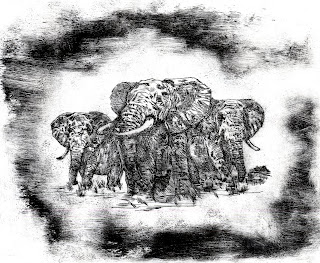
Hello everyone! This blog is my visual diary in which I shall be uploading all my illustrations, early concepts and course based finals. I work with various materials including pencils, inks, pens, etching, photography and various digital programs.
Thursday, 19 January 2012
Front cover and binding.
The binding is a compilation of two of my previous images, I felt I needed to include them some way so using Photoshop and Adobe InDesign I pieced these together, the format works out as an A5 book, the text used on the back of the book are reviews of the original. the character was created on Illustrator, and imported in, it represents the doctor immersing himself in his patients stories.
Final images for A Matter of Identity.
These images are all about identity, the message being that the patient does not remember anybody for more than a few seconds then he creates in his mid a new persona for himself and others around him, even his location will change in his belief.
A different variation of the original image, this time with the Eiffel Tower in the background to give the image a location, these people and the path they are taking represent how the world just passes on by him as he is constantly somewhere else in his own mind.
This image I feel is more faithful to the source material as he states himself he likes to imagine himself in an Arabian Nights tale, as he sits down, the world he imagines forms around him.
Taking the idea of Arabia to another level, I came up with this idea of him on one of his journeys into the unknown, his unquenchable thirst for adventure driving him on to create new environments and horizons.
A different version of the above image, with Arabian decorative stone work.
The more I tweaked this image the more I came to realize that it would better resemble a western scene, and this patient sees himself as a lone wanderer.
This image is my final piece, which fully rounds up the western theme, completed with stencil work, handmade then finished using Adobe Illustrator. The man is alone in his world, relying only on his imagination for comfort, walking towards his horse and readying himself for his next adventure.
Final images for A Walking Grove.
The overall style that I aimed for on these images was art deco, the patients passion for music needed to be shown but also his outstanding knowledge of New York and all its layout.
The map works are is supposed to be abstract buildings of the city.
Getting the skyline right on this image was tricky but achieved eventually. The maps were representing lights of the building here.
Here is one that I prefer more than some of the others. I feel that it works better in its approach to the buildings.
Here is another image created in the same way as the others although I worked a lot faster on this one to try and create a busy effect for the city, whilst it work least well in relation to the source material, it did end up being the main component of the front cover.
And here is my final piece, art deco was a strong influence, it was completed using stencil work, the Chrysler building was hand drawing using pens as were the musical notes. The image was handmade and then polished off in Adobe illustrator.
Final images for The Lost Mariner.
These images were produced with history in mind, all the history he has missed out on, I researched various newspapers and various events over the last sixty years, and made sure the newspaper stencils were relevant to the images in which they are featured.
Another variation, the ripped paper adds a nice simple effect of clouds.
First attempt at final image, however the plane wasn't visible enough.
This image started it all, the bold image of the plane in the foreground dominating the image, however the hectic background throwing information at you also catches the eye. It resembles all the events he has witnessed or heard about through the media, all of which is forgotten due to the overpowering memory of the war, which dominates his entire consciousness.
And here is the final image, similar to the previous ones, but with more emphasis on the plane and the overall composition being greater.
Final images for A Passage To India
These images are a collage of Indian pattern work, mixed with silhouettes and etching, an unusual mix, but i feel it works effectively.
Another variation of the above image, with the same idea but a different composition.
And this is the final image, I feel it works best out of all the images and also has the best layout. The various Indian pattern works have adopted an almost floral design.
Concepts for A Matter Of Identity.
Some stencil drawing followed next with the focus on lost identity, the emphasis being the lack of facial features , the animals and people within the image will have no distinguishing features to make them no more than empty shadows, as described in the book.
A few stencils of some possible locations, as he can be anywhere at any time.
Concepts for A Walking Grove.
Music notes, a main part of the source material.
New York street signs, the patient recalled being able to remember every street and its layout.
Some vintage cars.
Biro sketch of another street sign.
Concepts for The Lost Mariner
Sketch of the moon landing, getting a reflection in the visor was difficult.
Sketch of Sputnik 1.
Sketch of an aircraft, in pen.
Another drawing of the moon landing.
A sketch of scene from the Vietnam War.
Quick sketch of an aircraft carrier.
Subscribe to:
Comments (Atom)


